Demo Retrospective
Content warning: This is a SFW devlog about a NSFW/adult game. There is no nudity in this blog post but beware if you click deeper!
So after 10 updates over 2 months, the Private Dick demo is basically done! It's got all the content I planned, it works, it tells a bit of a story.
To continue to develop the game, I need to find funding so that I can pay artists, graphic designs and composers. I'm working on that, with a Kickstarter coming up I think in mid-June.
But in the meantime, I wanted to take a break to look back over the demo's development - what's been happening, what's changed, what works and what doesn't.
Art Style
I think the first and most obvious thing to talk about is the change in art style.
The very first 0.0.1 release of Private Dick looked like this:
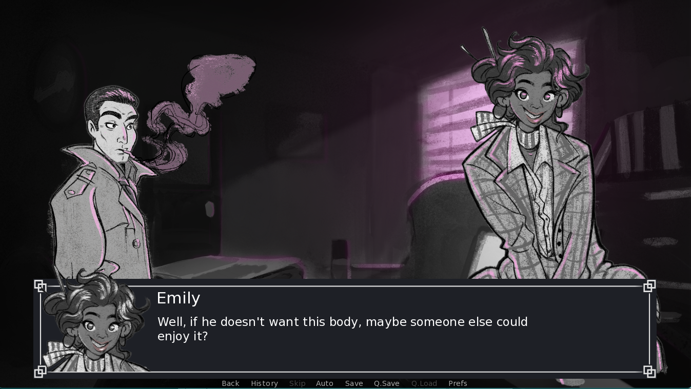
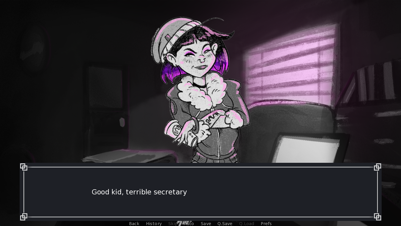
Now, the first thing to say here is that this doesn't look BAD. You can see most of the hallmarks of the game's current style here. The character assets are posed a bit strangely (Emily is enlarged in that first pic because she's talking, and Steele looks smaller because of the smoke in his sprite).
But over the months, there have been a few things I wanted to address:
- The style is just a bit too cartoony for what I want to be a very mature story. I also don't think it allows much nuance and detail in the sexual scenes.
- The dialog box takes up a huge chunk of the screen - and this is often a problem in sex scenes because, you know, there's often some key visual information in that bottom quarter (how many adult games have you played where they show a hot scene but you can't see anything because the text covers it up?!)
- Do we REALLY need to show the character name next to every line of dialog?
- Faces are duplicated - once for the dialog box, an once for the in-game character.
This last point is a really big deal for me and I've wrestled with it for weeks. When dialog appears at the bottom of the screen, your eye drifts down to read it, which means you can't see the character's facial expression. So to understand the emotional context of the line, you have to look up again. Your eyes need to be in two places at once to fully comprehend the dialog. I mean that's painful. So my solution, like most VN makers, is to duplicate the speaking character face in the bottom corner, next to the dialog, so that you can easily see their emotion and their dialog.
This was fine, and after a couple of updates I worked out how to easily sync facial expressions in the portrait and character.
By the time of the 0.0.10 update, the game looked very different:
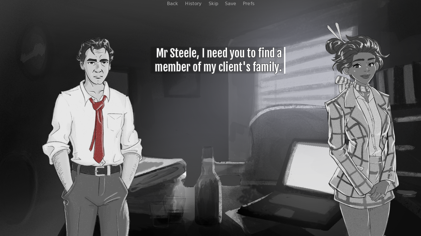
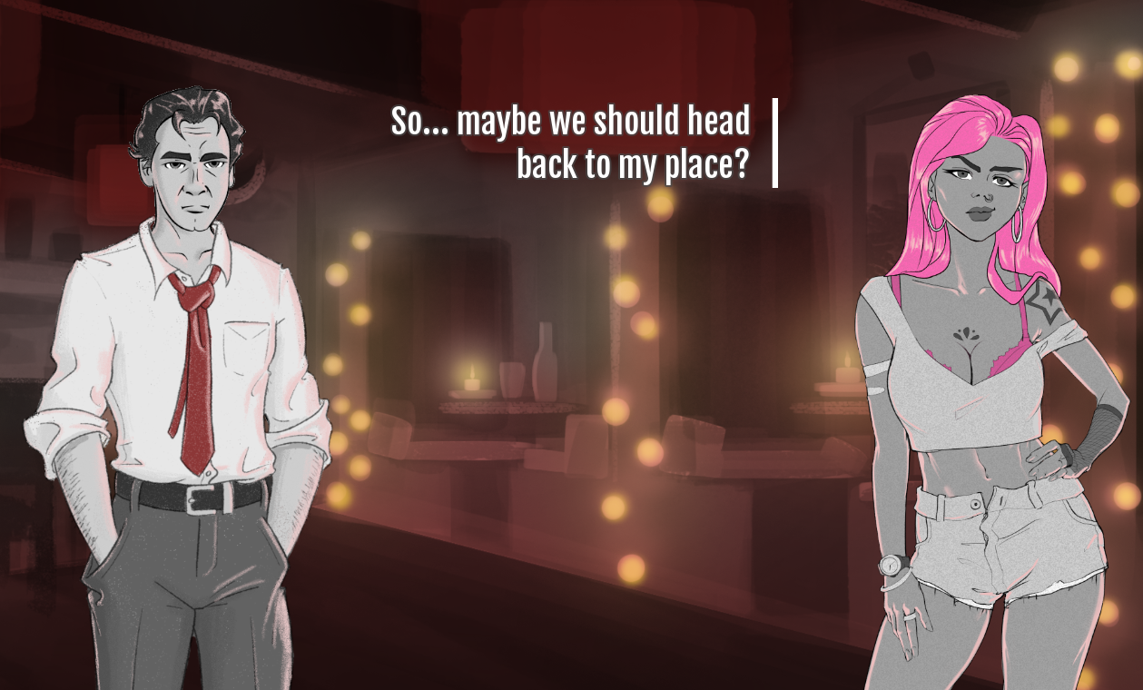
At risk of pointing out the obvious, let me just summarise the differences:
- The style has matured - more detail, more realism
- There is no heavy dialog box - text floats next to the speaking character
- There are no duplicated faces
Suddenly, Private Dick looks a lot less like a Ren'Py game and more like its own thing. It has more depth. more style, less bloat, a cleaner, more readable style.
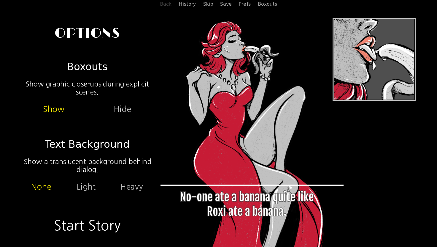
Since 0.0.4, when starting the game, there's an options screen which lets you calibrate some settings. This now includes those text boxes, adding some shadowing if you find the contrast too low (and I know a lot of people will!).
Story
So, I fucked this bit up. And at this point I have to live with it because I simply cannot afford to fix it.
It's a classic error: I started at the start.
The demo for Private Dick is the first act of a five-act game (well, actually it's PART of the first act). It sets up a lot of characters and a lot of storylines, as well as some of the main themes and mechanics of the game. And it does a fairly decent job of that.
The problem is, of course, that none of those threads are picked up in the demo. It's one thing to leave your audience in suspense, but the demo does far too much set up and delivers too little payoff. I think that the story is engaging, the dialog is strong and the sex is exciting: but ultimately I think the story doesn't have time to do anything.
I mean, if you've played the demo, can you tell me what the game is about?
And if there's one thing I want the Private Dick demo to do, it's prove that I can tell a good story.
The other issue I'm having is that the original five-act story isn't going to be what I kickstart. It's too much, too long, too ambitious, too expensive for me to just jump straight into that. Instead, and learning the lesson from the demo, I want to release a shorter, tighter, more compelling story. A 2 hour experience rather than a 20 hour one. I'm now going to tell that five-act story over several distinct games, rather than one monster which I may never finish (let alone fund).
What I wish I'd done - and I did consider at many points during development - was make the demo a single case with a start, middle and end. I should have told one short story with a few twists and turns, rather than trying to produce a first act which doesn't really resolve anything.
Project
It's important to update your game regularly for several reasons:
- It shows players that development is active.
- Each release is a chance to promote the game.
- It enables me to be responsive to fix issues players may have.
I'm really happy that I managed an almost weekly release for Private Dick, usually on a Friday.
The difficulty with the project has really been that change in art style. Having released the game, it quickly became obvious to me that I would have to re-do just about all of the character art. It had been expensive to produce in the first place - in terms of time and money - and it would be expensive to re-do it all.
Make no mistake, this was a big risk for the project. Instead of moving forward and giving players new content (and giving me new material to promote), I had to tread water and do everything again. It's a hard sell for existing fans who liked the game and don't really want the style to change. And it's maybe worrying for new players who take a look and wonder why the project is being rebuilt already.
Having to do this work massively delayed my Kickstarter plans as well. I could not in good conscience build a kickstarter around one art style, then immediately change it as soon as the money came through. That would feel dishonest and that's just not what I'm about. So as well as costing me more money, it also delayed, by at least a month, any revenue that would enable me to keep going.
Was it worth it? I'm going to say, emphatically, YES. I just think the game feels BETTER now, I think I'm a step closer to appealing to the right audience, and delivering a gritty, dark, mature story. I've also had some really good validation from players who seem to be enjoying the new style.
Having said that, I still can't escape the feeling that the new style has just a little less character than the old cartoons. For all that I've gained, and for all that this was the right move, I can't shake the feeling I've lost something.
Success?
So, was the demo a success?
I guess that depends on what metric you use! Unfortunately I don't really have a good aim for the demo beyond "I want everyone to play it and love it", and I don' t even have very good metrics for that.
Creatively I'm really proud of the demo. I think it's a really strong statement of intent. It does a number of things that, for me anyway, make it stand out amongst the adult gaming crowd. There are things in this demo that I, at least, have never seen. Yes, I wish I'd built the game around a stronger core storyline and boy do I wish I'd gotten the art right first time around. But I'm really happy with where I've ended up.
But it's not about pleasing me, is it?
For a new dev starting from 0, I think this demo has punched above its weight. I've released SFW game with nothing like the numbers I've had here: 10k views, over 1,000 downloads, over 3,000 browser plays, over 100 collections. I mean, those numbers are great!
But to make my Kickstarter goal I need to multiply them all by 10. In all honesty I had hoped for a little more. I've had no comments and only three ratings. I've had 70 followers, which is OK. I've had very little tractions from streamers, vtubers or the adult games press. I haven't made very strong impressions on Reddit, Twitter or f95Zone, where I'd really hoped to build a community. I haven't seen anything which convinces me I can sell enough copies to fund further development.
So a good start, then, but I've got a lot more to do.
Files
Get Private Dick: Lipstick & Lies
Private Dick: Lipstick & Lies
An erotic neo-noir visual novel
More posts
- New Demo Out Now!May 11, 2023
- One Year Anniversary!Mar 25, 2023
- New Demo Early April (with voice!)Mar 16, 2023
- Project UpdateJan 16, 2023
- The Big PreviewNov 16, 2022
- devlog: Pressing ForwardAug 12, 2022
- Release Notes 0.1.0 (and a project update)Jul 25, 2022
- Closing the Alpha and Next StepsJun 07, 2022
- 0.0.12 Release NotesJun 01, 2022
Leave a comment
Log in with itch.io to leave a comment.